Sandwich
A Typeface with Horizontal Stress
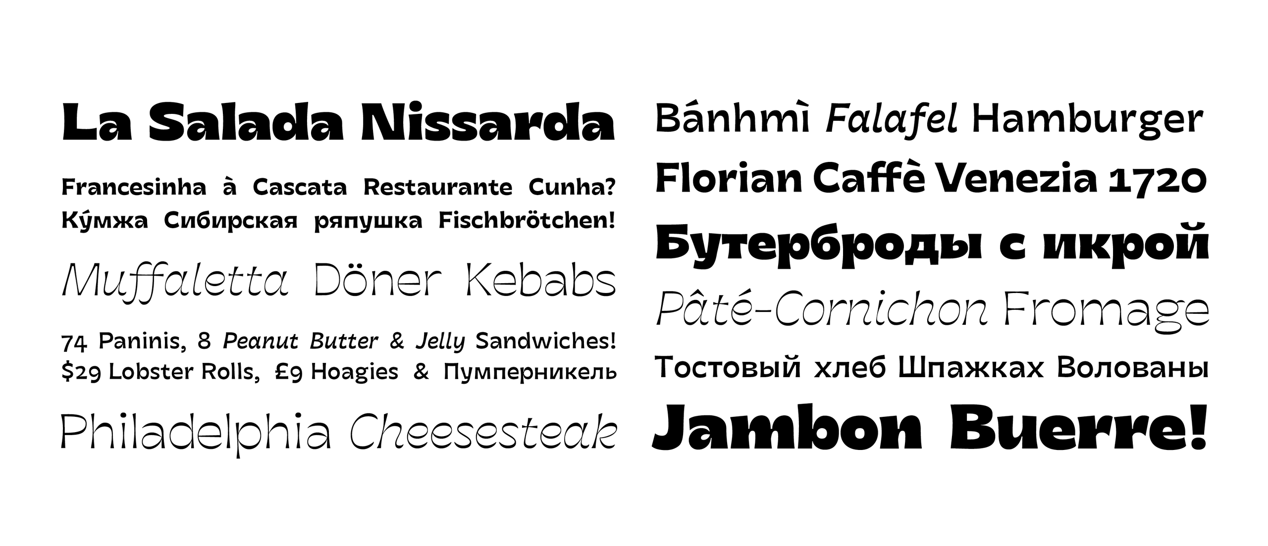
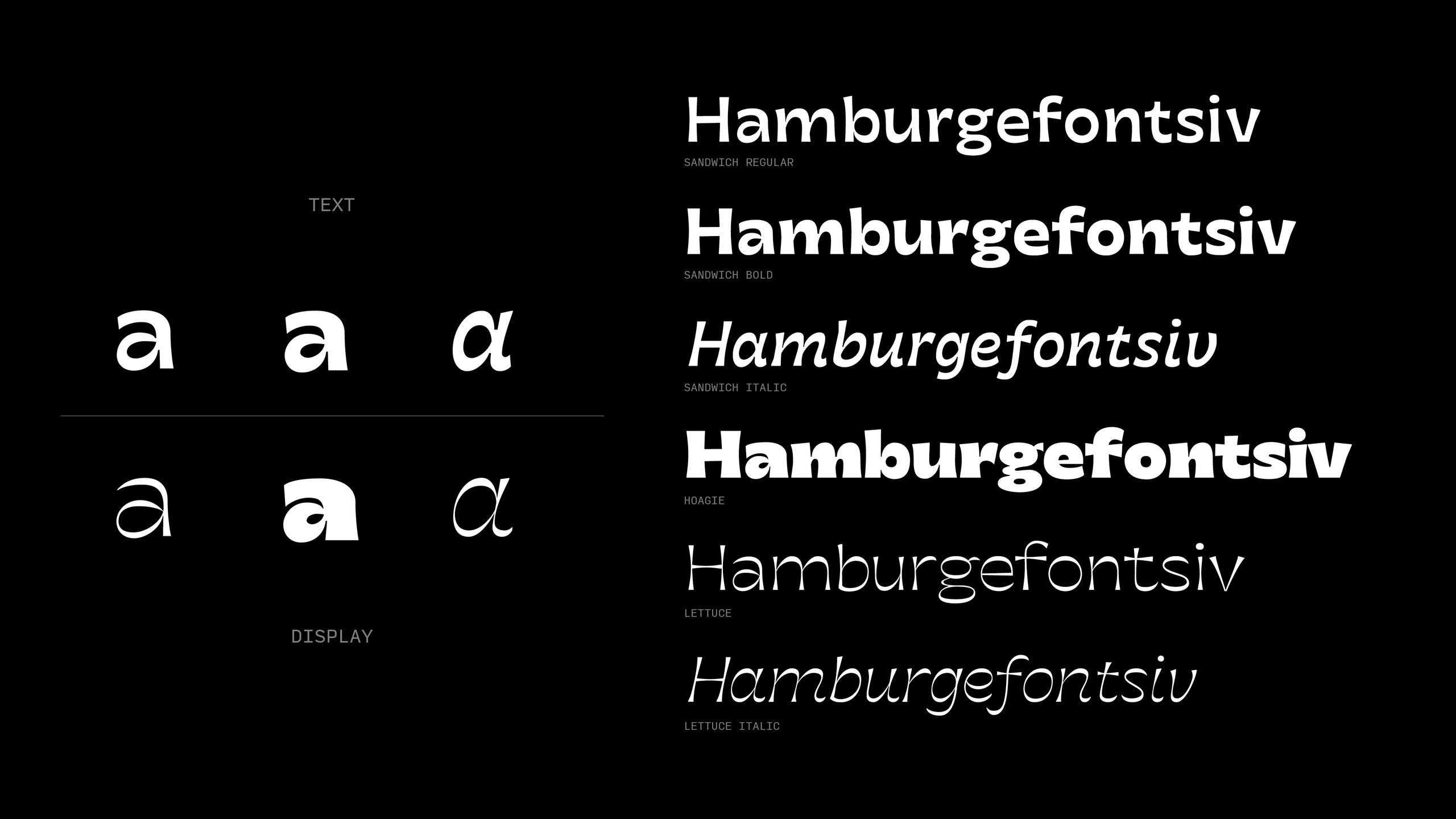
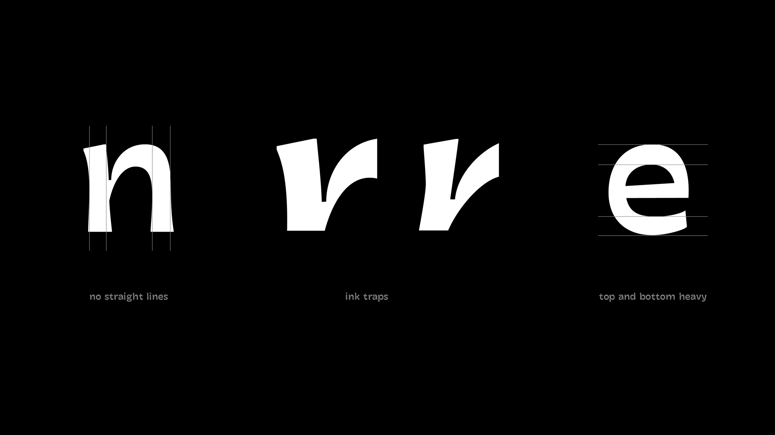
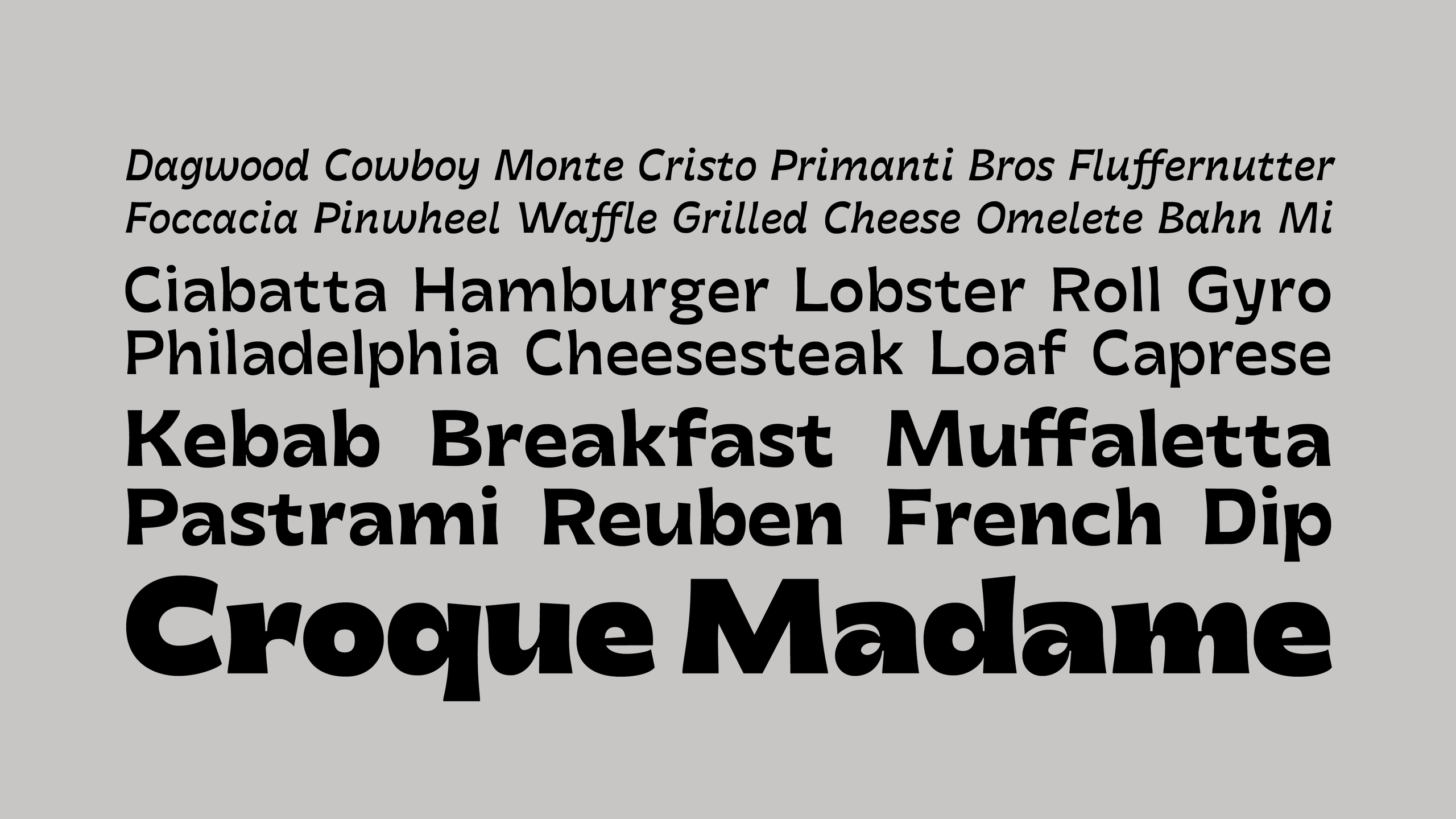
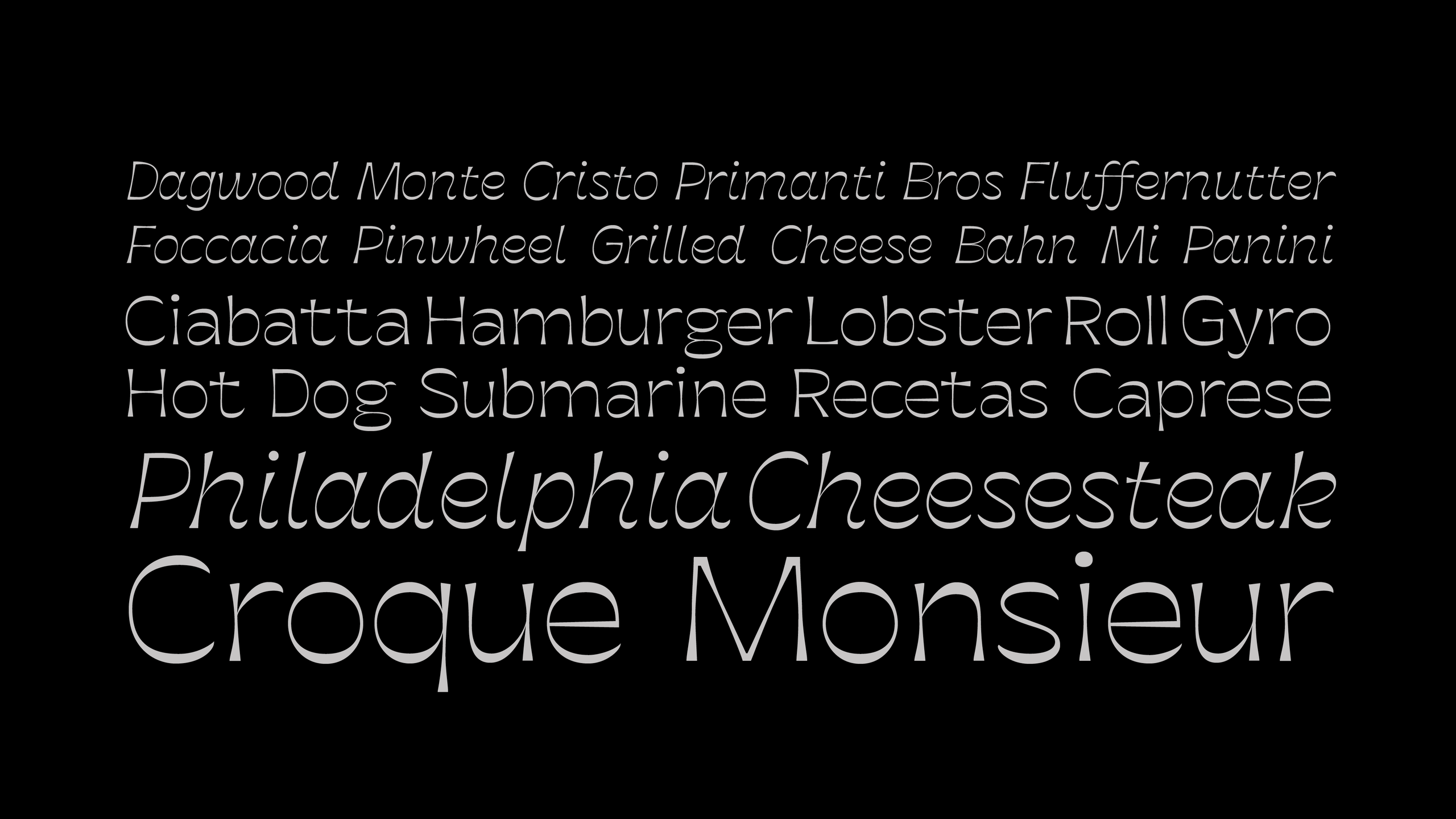
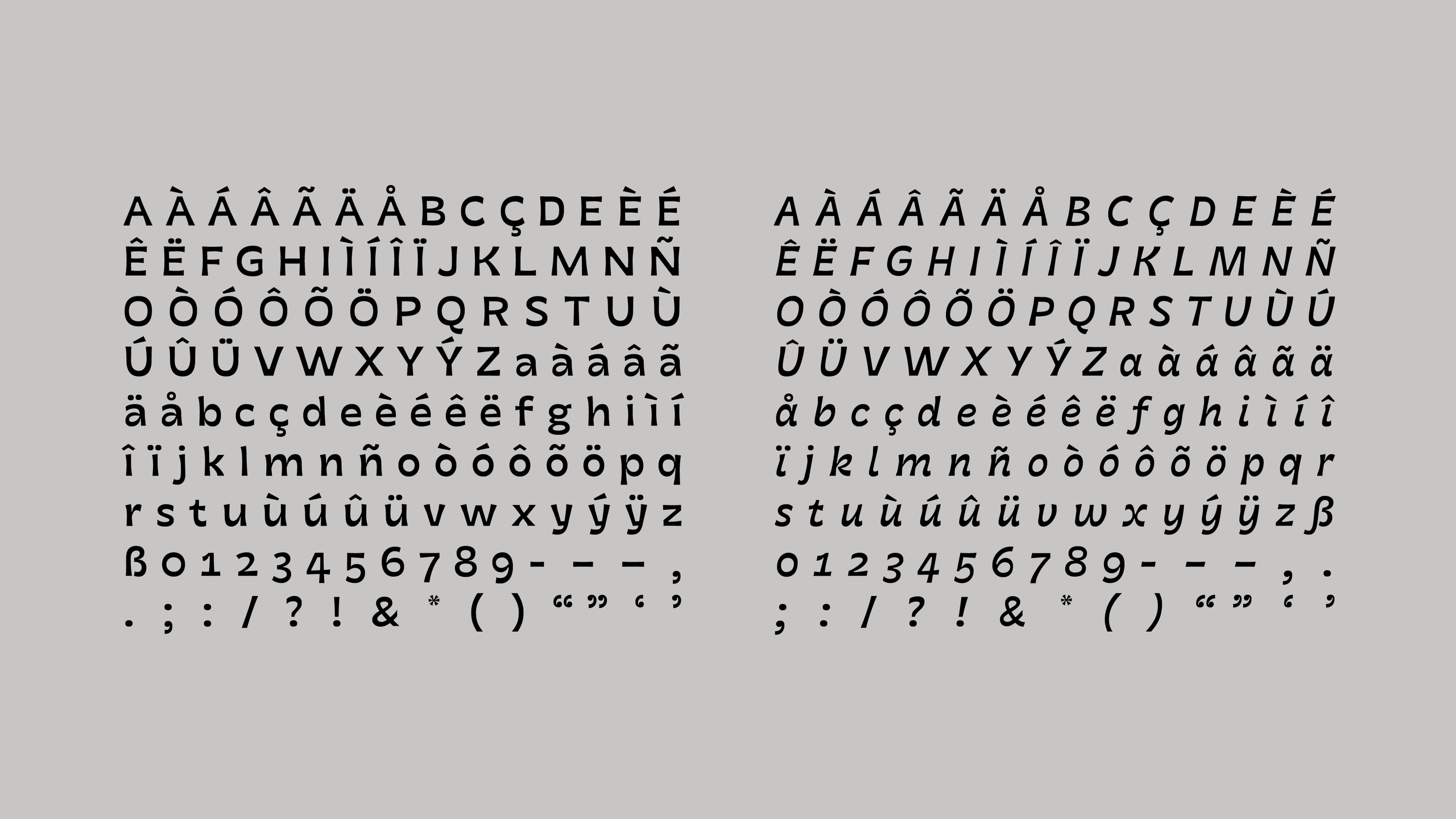
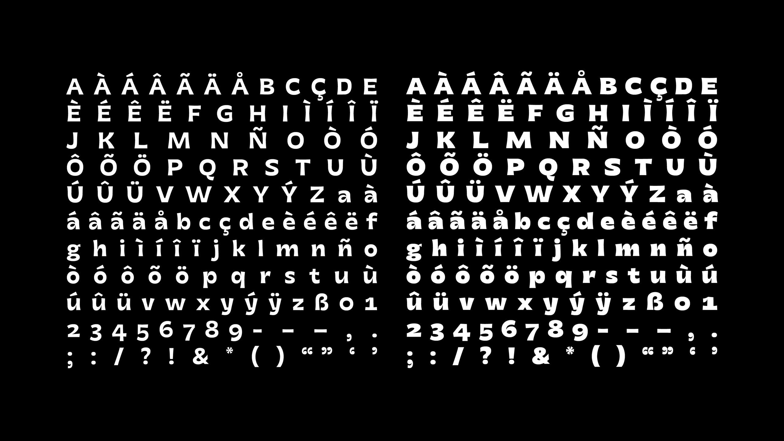
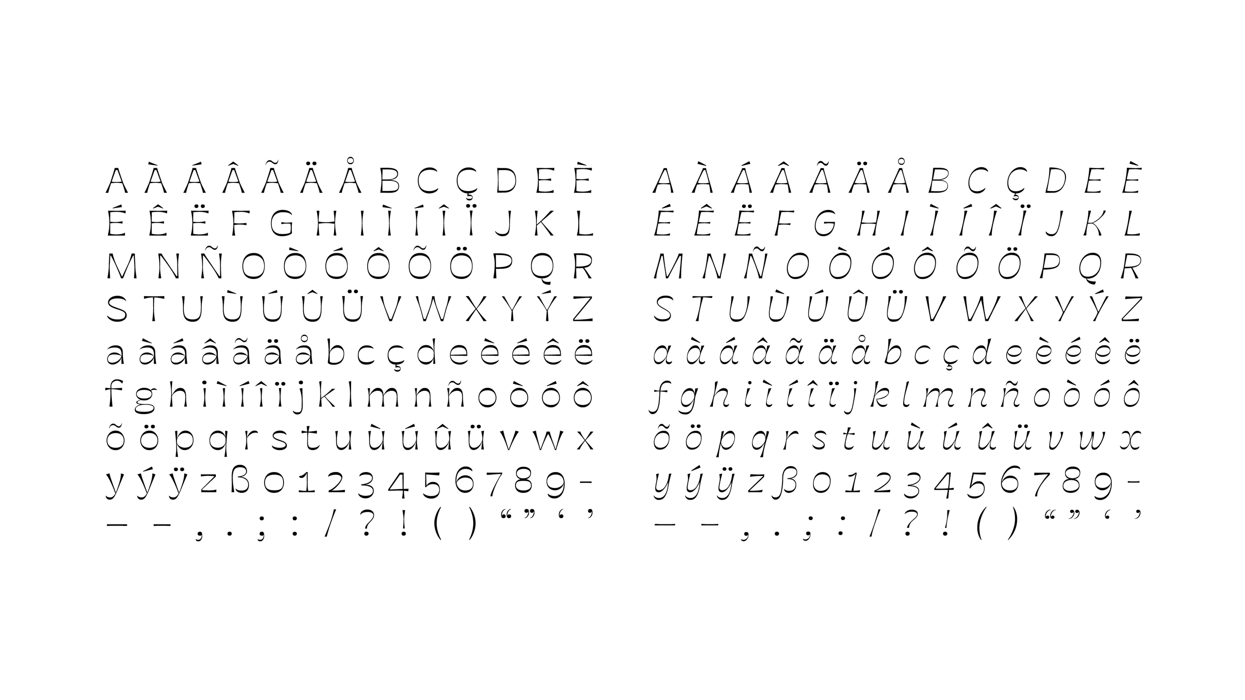
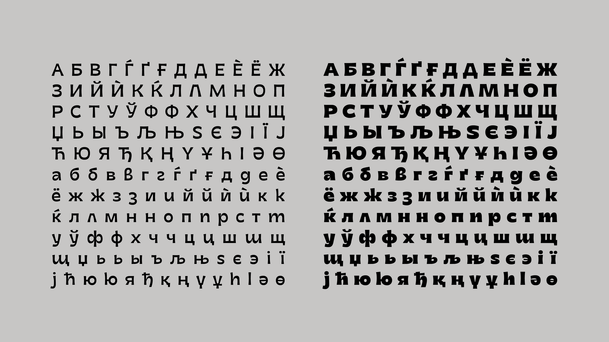
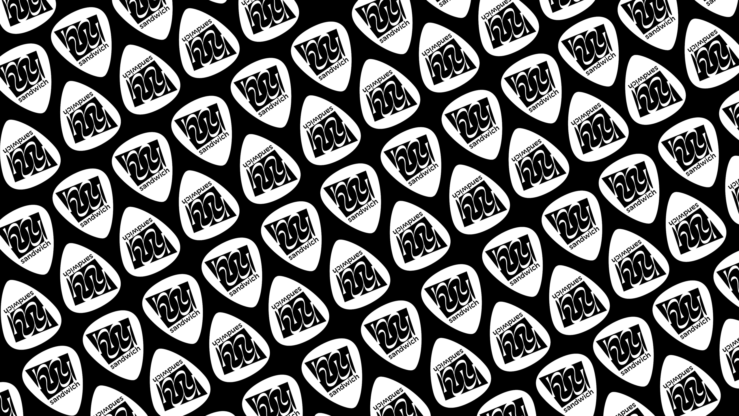
Started during my time at Type@Cooper West in 2017, Sandwich is a flared sans-serif typeface family that emphasizes the horizontal strokes of the letterforms. It aims to subvert the conventions of thicks and thins without entirely throwing them out of the window. It is a versatile family designed to be used both in small contexts such as a guitar pick or liner notes and in display contexts such as an album cover. It was awarded the Type Directors Club Certificate of Excellence and was one of the finalists in the Morisawa Type Design Competition
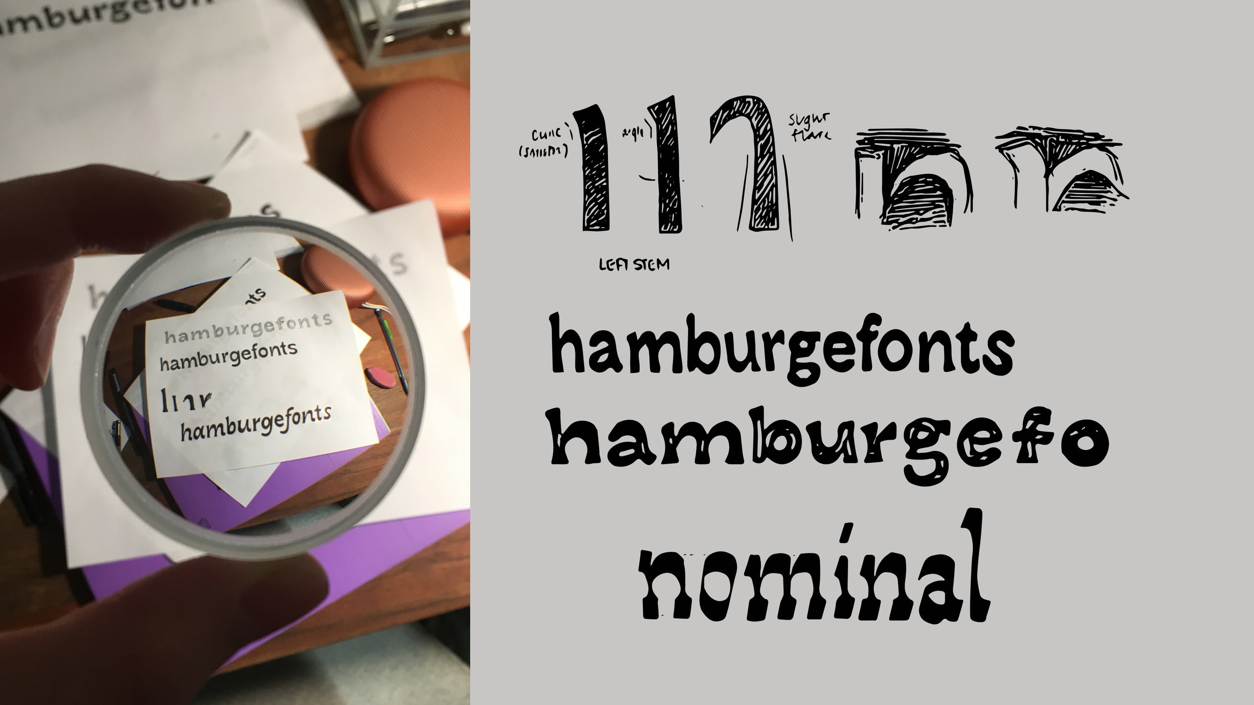
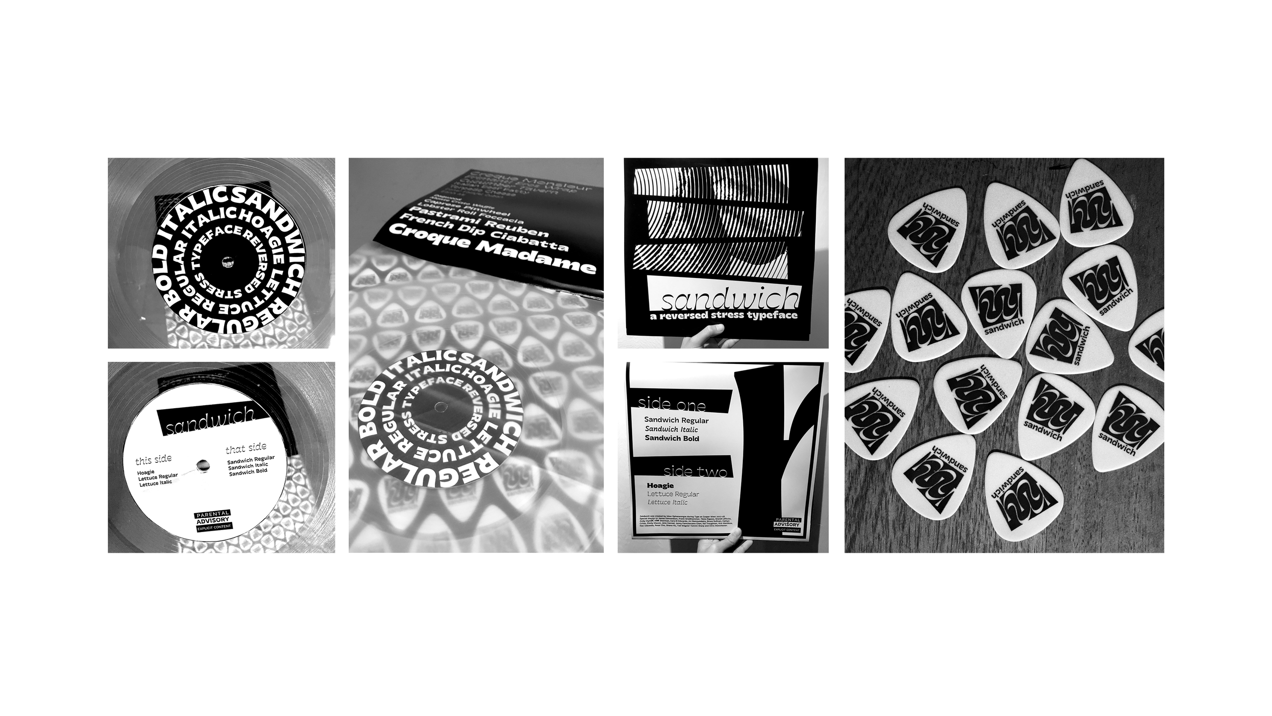
The process of creating this typeface can be found below and on the Letterform Archive's online archive.
PDF Specimen