Konstrukt
An In-progress Geometric Sans
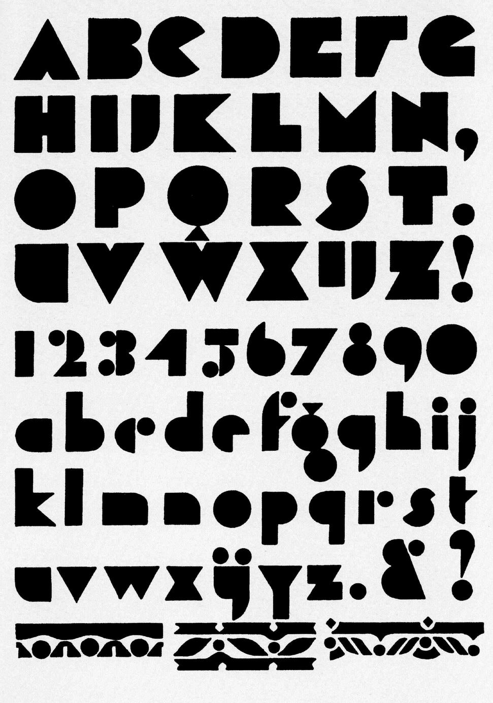
This project started as a digitization of letters drawn by André Vlaanderen (Amsterdam, 1928, Private collection). I was draw to the idea of constructing letters out of geometric shapes while retaining the silhouettes of the original shapes. With this system, each letter by itself might not read like a letter but in tandem with other letters, words can be derived.
Here is my first digitization of Vlaanderen’s alphabets. I tried to stay true to the original with the exception of the spaces between the shapes that make up a single letter (
c, r, Y). The spaces between the shapes were reduced to so that the letter appears more like a single unit rather than two separate shapes.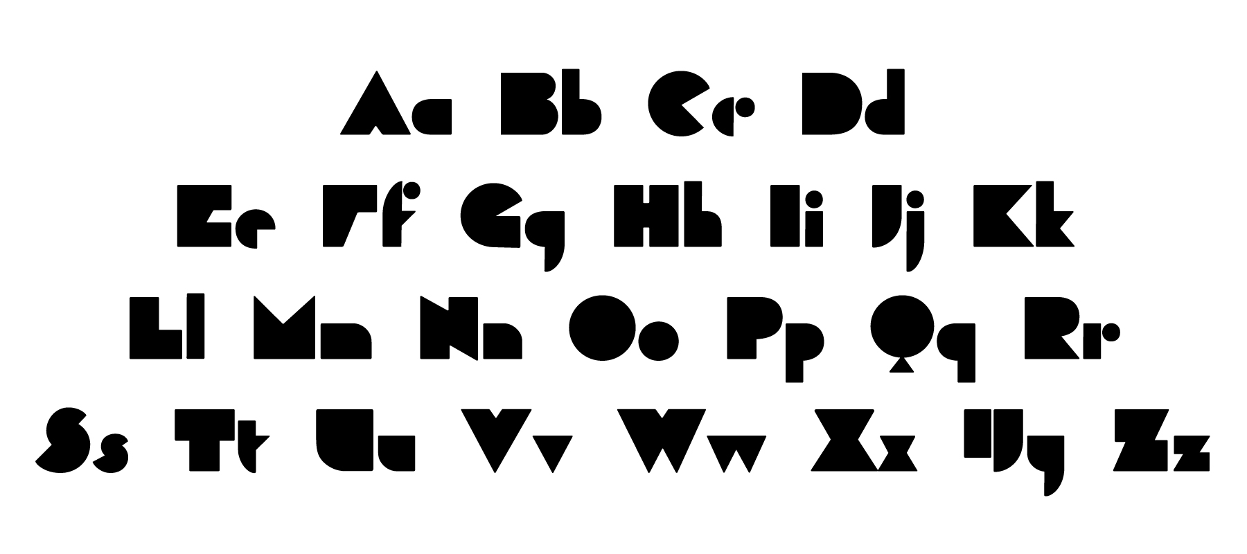
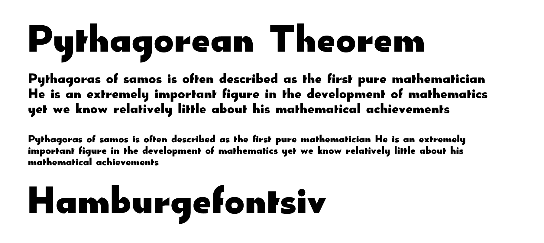
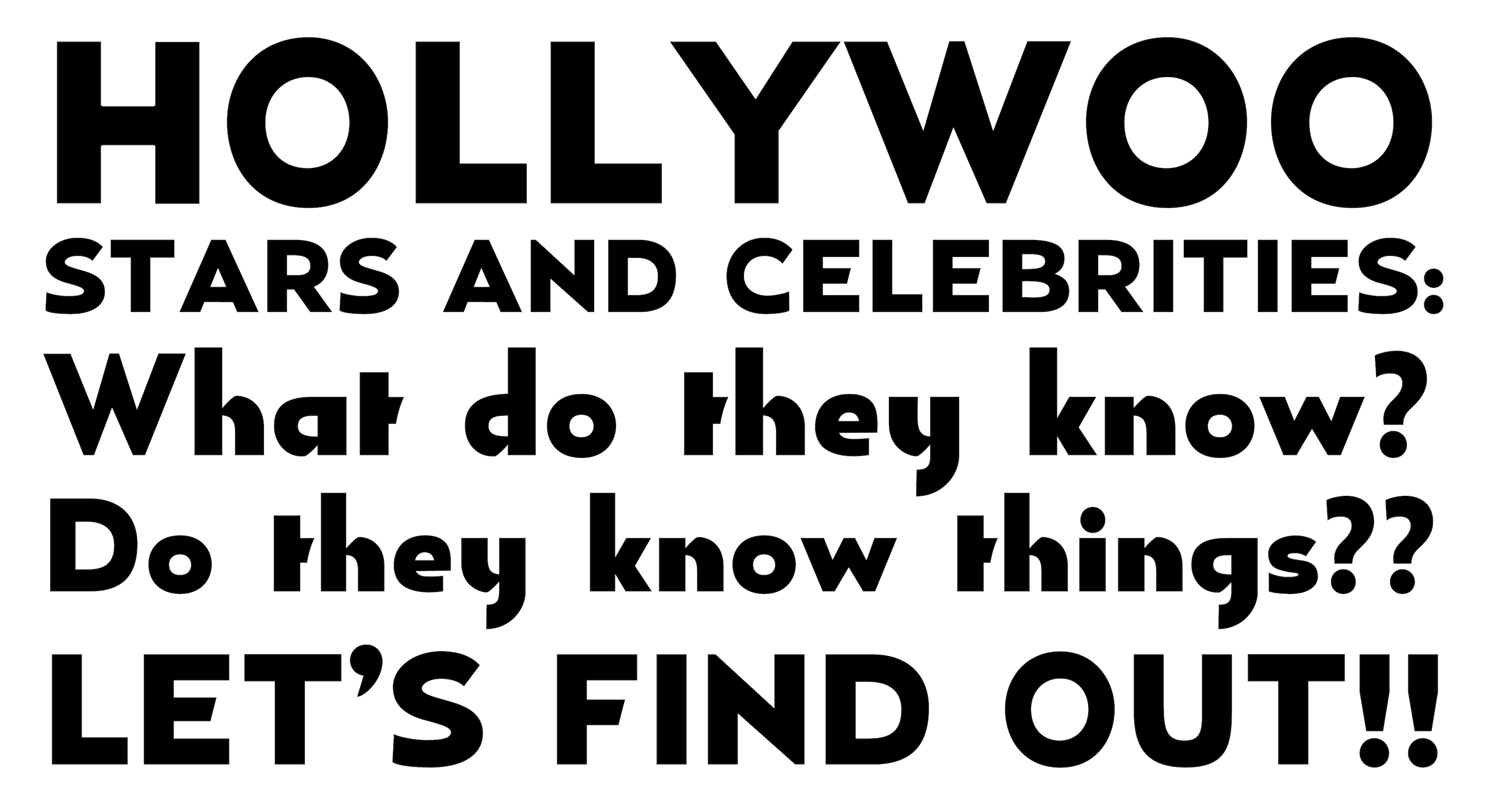
After initial digitization, I imagined what a text version of this typeface would be like. I started by adding counters to the original design and increasing the x-height.
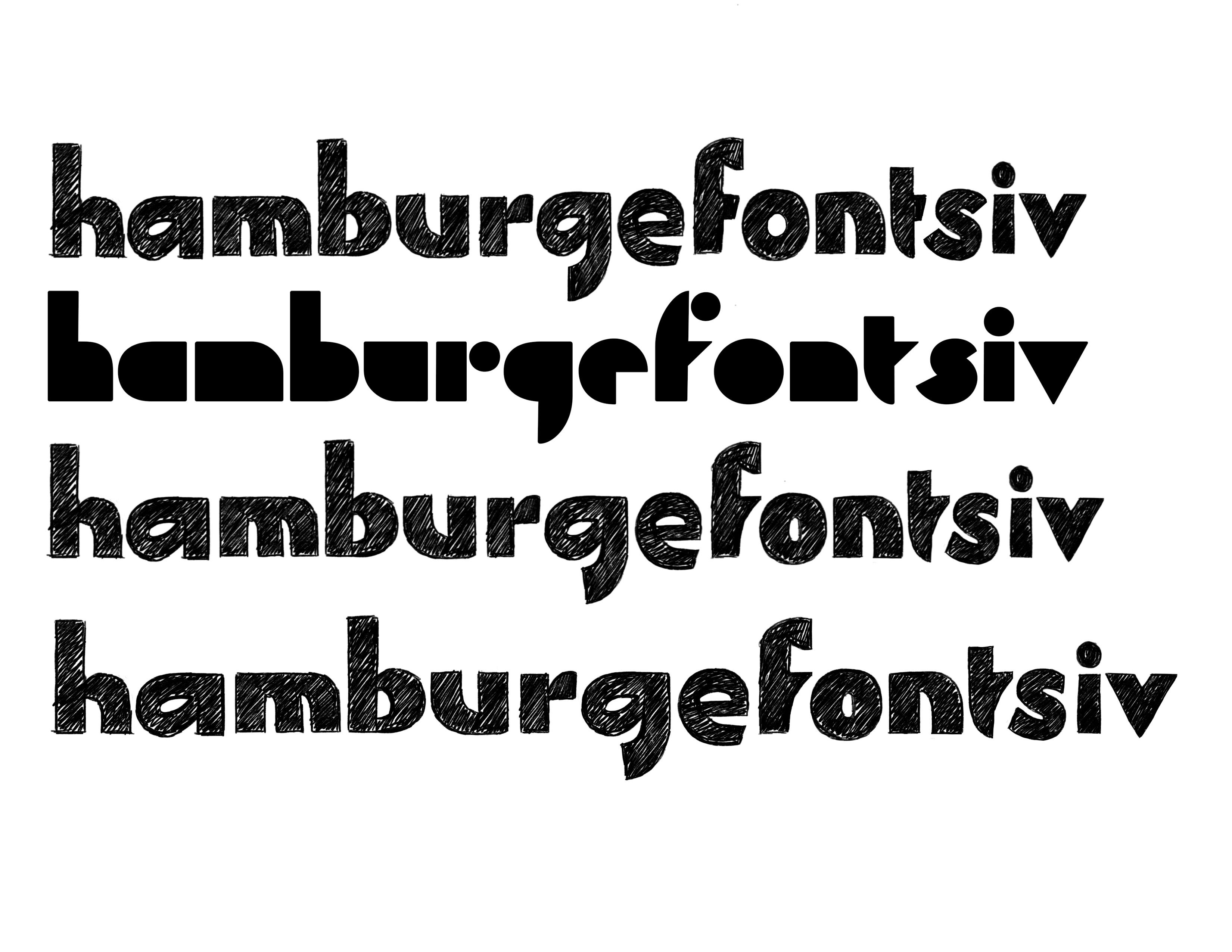
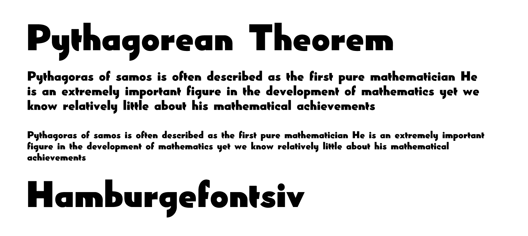
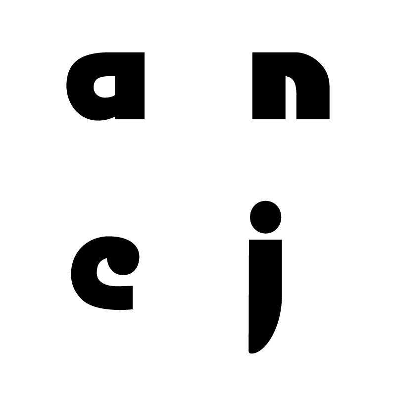
The result was a typeface that has many divergent characteristics: both straight and curved stems, both straight and curved stroke endings, ball terminals and so on. There are many thick strokes joining together (for example,
a, n) so the color is too dark. With these inconsistencies, this version does not function well in text sizes.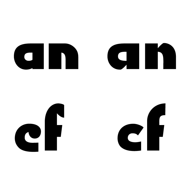
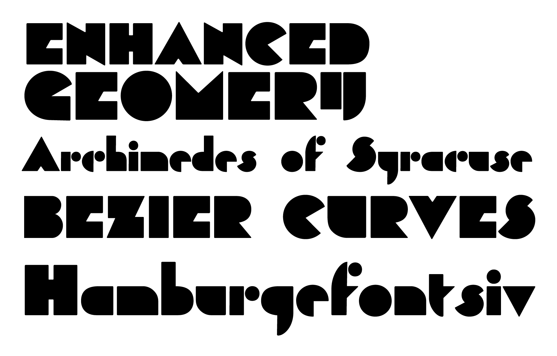
To make the color lighter, I introduced angled cuts to the letters. The terminals were changed to be more consistent.
With these adjustments, the overall rhythm improved. However, there were still too many ingredients in the mix.

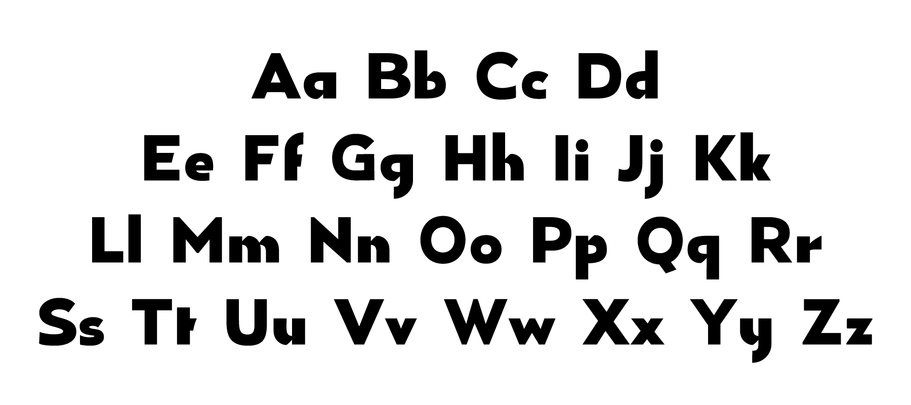
To continue, I decided take a more systematic approach by defining the core characteristics of each letter:
- constructed with the same straight and curved lines (as if they were drawn with rectangular ribbons)
- containing only one diagonal part (angled cuts)
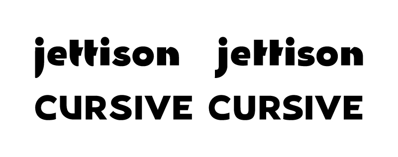
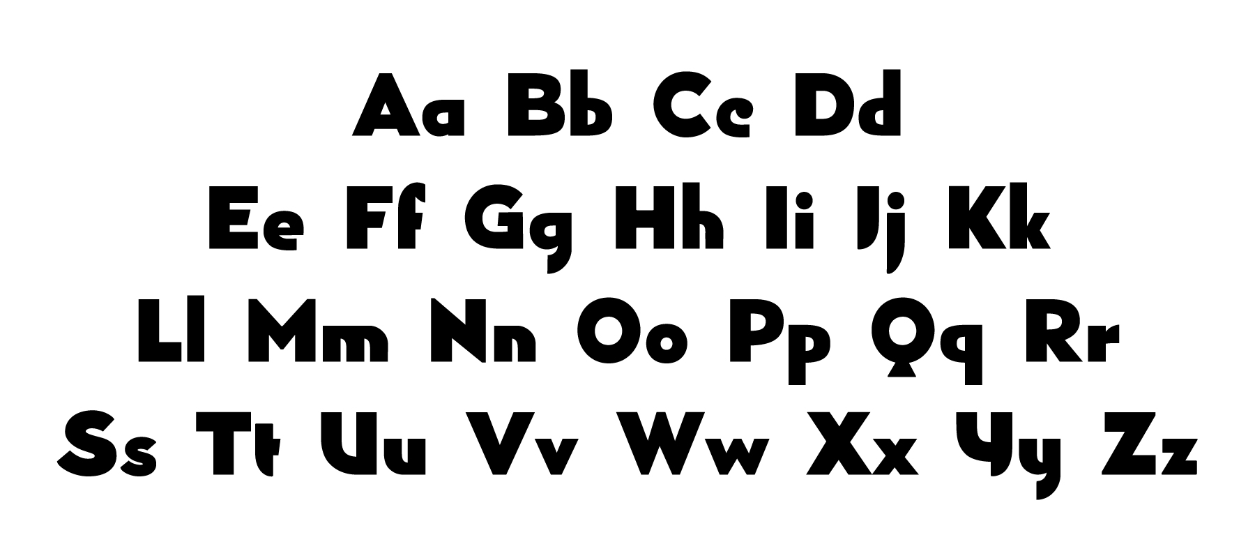
Within this system, the curved stems of
j,t, and U stand out from the rest of the letters. They are updated to be adhere more to the defining characteristics of the typeface.So far, I have a rough visual system to guide the progression of this typeface. My goal is to create a text typeface that carries the spirit of the original drawing, that is, a system of letters constructed from geometric shapes.